Saturday, October 29, 2011

Papertrey Ink MIM - Brayered Impressions

Papertrey Ink's latest Make It Monday challenge, presented by Betsy Veldman, was to brayer ink over an embossed panel.  My brayer is in pretty bad shape so I just went old school and did direct to paper with my ink pad.  I played with several different impression plates and inks and this is the one that became a card.


I used the Animal Prints Impression Plate which I haven't played with yet.  I also elected to use several other die cuts - the Heart #7 by Accucut & the Zelda alpha from Quickutz (another rarely used item) - to keep it simple and show off the embossing.  The inside has the remainder of the sentiment.


The sentiment is from Wonderful Words Additions and Tiny Treats: Valentines.
This was a really fun technique and one I want to remember to use more in the future.


One more creation from last night finally put a favorite colored image onto a card.  I wanted to really highlight the colored image, after all she's the rock star.  One thing I really liked is the paper on the bottom of the card - the design really reminds me of bearings. 

Tuesday, October 25, 2011

Paper Vineyard "Joy of the Journey" Challenge

I had fun creating this card.  Sometimes it's nice to just let the products speak and see what they say and where we go.  This one was telling me that I don't always have to leave products just as they come.  Here's what I mean.

This journaling card was included in the DT package.  It was very nice just as it was.  And there's lot's that could be done with it.  What I chose to do with it was to die cut it and use it in pieces.


Using a one of the Ribbon Tags Trio 3 dies from Spellbinders I singled out the large "JOY" to be my sentiment focus.  I trimmed out "bring" from the rest of the sentiment to create a new phrase, one that fit my style and creative idea better.

A few other things to note about this particular card: 
- the little brown bag that some of the smaller pieces of the DT kit came in just seemed to cry out to be used.  It was a typical kraft color but had a waxy type surface. I die cut it with more Spellbinders dies. Sooooo perfect for scrunching!  Love the shabby, vintage-y, messy look of them. 
-  there was a little bit of tulle in our package too.  I thought it would look really pretty and soften the paper flowers sticking out of the top of my flower pot.
- I stitched the dark brown Core'dinations to my Reminesce patterned paper.  And I added a little more stitching in the upper right corner for more texture.

I've been working on building my stash of cards that I can just grab and write a note in when I need one on short notice.  Because of the non-specific sentiment this one will be a great addition to my stash.

Speaking of adding to my stash - Paper Vineyard has everything in the store on sale for 25% off!! That's a great deal to help you add to your stash and make it easier for the store to make the move next door.

And speaking of moving - if you're on the West side, another one of my favorite stores, The Creative Quest, and where I often teach, is closing.  Get 30% off everything in the store.  Look for a new incarnation of this store in Dec in the little house right next door.

Sunday, October 23, 2011

Sneaking in Under the Wire....

Recovering today from the big 4 yr old birthday bash yesterday and Paste Eater's Night right after.  Football, sadly, wasn't all that exciting.  I managed to get a card created that incorporated 4 different challenges.

Challenge #1 - MIM with Papertrey Ink was to do a card with multiple mats & framing
                      This one ends in just an hour or so.
Challenge #2 - Papertrey Playhouse challenge to use stamps that haven't seen ink
                      This one was from September 14 that I didn't get to play along with.
Challenge #3 - Papertrey Playhouse challenge to use dies that haven't cut paper 
                       This one was from September 28 and I didn't get to play along with it either.
Challenge #4 - Papertrey Playhouse Season of Change photo inspiration
                       This challenge is still up if you'd like to play along.  You should see the photo - so pretty but makes me happy to be in the southwest without snow!


I pulled out my Mat Stack Collection stamp sets & dies.  I've got several of them but just haven't used them all that much.  I figured they were perfect for Dawn's multi-mat & frame challenge and also fit perfectly with Dana's September challenges.  Then all I needed to do was to incorporate Victoria's challenge. The first thing that stood out to me from the photo Victoria posted as inspiration were the colors.  So I kept it simple with red, orange & white.

Supply list: all items PTI unless noted otherwise - Mat Stack 4 collection stamp & die (orange herringbone), Mat Stack 2 collection stamp (red flourish), Mat Stack 1 collection stamp (leaf & acorn), Falling Leaves (sentiment),  Linen/Canvas impression plate, seam binding - United Ribbons, orange cardstock - Core'dinations, card base & ink - The Paper Company

Tuesday, October 18, 2011

Paper Vineyard Authentique & Favorite Tool Challenge

I've been hearing a lot about Authentique but hadn't been able to see it or play with it.  So I was really delighted when I saw this challenge.  I was even happier when I saw the paper.  So very pretty.  Paper Vineyard has 4 of their collections in the store.  I'll be grabbing up more from the Blissful line as well as lots of papers from the Uncommon line.  They've also got Journey & Glowing.  And if those papers aren't enough to entice you into the store - EVERYTHING is 25% off thru the end of the month!

In addition to using the Authentique papers we were to highlight our favorite tool.  I'm so bad at following directions. *sigh* I couldn't choose just one tool.  I'm a total tool geek & believe that tools should make your crafting time faster & easier.  I NEVER seem to create anything without my Fiskars 6" trimmer, Zip Dry adhesive & Tweezer Bee tweezers.  And more often than not you'll also find Spellbinders Dies on my projects.  All of these tools do just that for me.


Here's the card I created for the challenge.  I had a Core'dinations card base (love those too!) that perfectly matched the Blissful line.  I distressed the edge of my patterned paper and stitched a strip of matching patterned paper near the top.  Some dark grey grosgrain (love how the stitching around the card is mimicked with the saddle stitch on it) under a die cut, embossed and sanded Picot Edge Circle.   I added a few more Spellbinder die cut & embossed circles on top of it with a stamped message.  I kept this one non-theme specific so I can use it for any number of occasions.  

Sunday, October 16, 2011

A little more coloring recently..

Still trying to get myself caught up on class projects (look for posts on them and updates in the Class Projects tab) but took a little time last night to just color.  Felt really good.  I pulled out the Roxy roller girl stamp from Kraftin' Kimmie I got from 7 Kids College Fund recently.  (For my favorite stamps from KK check out the images in Moonlight Whispers)

I wanted to send a thank you card to my soul sister for a thoroughly awesome & unexpected gift and for helping talk me down off the ledge recently.  Since she's a derby girl, and a large part of the reason I went for it, Roxy just seemed like the perfect choice.

Here's my colored image
If you checked Roxy out (go on, it's a live link) you'll see that my roller girl doesn't look the same.  I'm starting to branch out a little bit and have begun "altering" an image once it's stamped to make it personal.  Super easy to do, even if you can't draw a straight line.  Just make sure you're drawing with a Copic Multiliner.  You'll be able to color over it with your Copics with no issue.

I'll be creating a card to put Roxy on soon so she can get airborne to Utah.  And if you're curious about the colors I choose, I wanted her to look like #57 Miss Business Das and mimic the colors for Wasatch Roller Derby.

And one additional item I colored last night.  After my PVDT post, I grabbed a scrap of shrink plastic to try to make a wine charm.  I sanded the shrink plastic and stamped the image using Memento ink.  I didn't dry so I just set it aside on my desk and forgot about it.  Last night it was plenty dry to color. 

I used: V95, BV23, V99, RV69, YG93, YG95, YG99 

The colors will deepen, darken and become more intense as the plastic shrinks.  That meant the leaves were much darker than I liked.  Easy solution.  A little Colorless Blender on terry cloth dabbed onto the colored area lightened them right up.  To make a set of wine charms I'd likely color each charm using a  monochromatic color scheme with each charm being a specific color of the rainbow.  Hmm.  Maybe I've got an idea for some Christmas gifts this year.

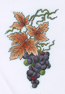
One last image for you.  I colored the grapes one more time.  This time I changed up the leaves a little.  Much happier with them.  I used all of the same colors as the original I just changed what I colored with them.  What do you think of the difference?

Tuesday, October 11, 2011

Paper Vineyard Stampendous Challenge

Just a quick, partial post to share a Stampendous image I colored last night.  I haven't made the card part yet. 

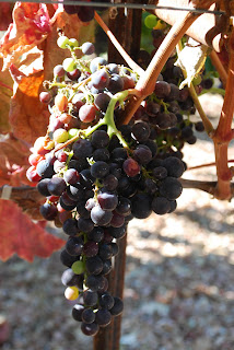
One thing that has been such a help when I color is to find a real life image similar to my stamped image and use it as a reference.  I was very lucky to have just such a photo in my photo album.  On a visit to California in 2009, Mel & I stayed with some friends that took us to some wine tastings.  I handed my camera over to Sammy, their 9 year old daughter, and she got some AMAZING shots.  I love handing the camera to a kid.  You really do get images you would never have thought of.  Here's Sammy's photo.  Pretty awesome right??!

I love how strongly & clearly you can see the sunlight.  I love the colors that you see in the grapes.  However, with the light showing on the right side it wasn't perfect for the image I needed to color.


This is the Grape Vines image from Stampendous.

The artist is telling me that this image is darker on the right side.  How do I know this?  It's the lines that the artist has added on the grapes, all on the right side.  So what to do?

I flipped the image on the computer.  :)    Viola! Now I have the perfect image to help me color.


       Here's my colored image.


This image was a challenge because of the deeper tones in the grapes.  How to get that beautiful dark color with out just having dark blobs?  My answer was layering.  This is where Copics really outperform any other marker.
                                                   
              Here are the colors I used


I really am looking forward to coloring this a couple more times.  And can you imagine this done on shrink plastic to create a wine charm??  Put that on my to do list!

Wednesday, October 5, 2011

October Classes

If you're looking for my Paper Vineyard Design Team post, please scroll down.  :)

Whew!!  I don't post for a month and then WHAM!! a whole bunch all at once.  Isn't that kind of how life seems to come at us though? 

With the addition of roller derby to my schedule I haven't restructured my time management.  After the first two days this week, that HAS to change.  So, in my new effort to get myself back on track, I've updated the Class Projects Tab with all the photos and information on the classes I'm offering in October.  My goal is to have the November projects up no later than next week.  (See if I put it out there I'll have to be accountable.  Sad I have to trick myself like that isn't it??!)

I've got something really amazing and awesome in the works to begin in January.  Once I've got dates and pics I'll post them. 

And in case I haven't told you, Thank you.  I really appreciate that you choose to take a class with me.

Have a wonderful Wednesday!

Tuesday, October 4, 2011

50% OFF!!!

If you're looking for my Paper Vineyard Design Team post, please scroll down.
But maybe read about the great deal you can get and help out me and my derby sisters first.  :)

Yep.  You saw that correctly.  
Who doesn't love to get something fabulous for HALF price??  
And support a fabulous group at the same time?!!
 

Get 50% off the AZ State Fair when you buy your tickets online and support Arizona Roller Derby at the same time!!! Just enter "azderby11" at check out.  This deal is available thru Oct 13. If you're buying tickets after the 13th, you won't get the half off but you will still be helping out AZ Roller Derby.

And hey, I made it easy by giving you a live link!!  PLEASE, PLEASE re-post this to your blogs, pages, twitter or anywhere else to get the word out.  And ask your friends to spread the word as well.  You'll have my undying love & devotion and maybe even a signed derby photo if I ever get one.  :D

Deep in the heart of Texas

I've long wanted to participate in design teams but felt it would be a conflict when I was a sales rep.  So I'm very happy to have been able to join the design team at Paper Vineyard recently.  Each week Adriana asks that the DT create with a specific theme and/or product.  Today I'm showcasing the really cool custom chipboard state names offered through Grapevine Designs.  (If you haven't seen the stuff they're doing, you are so totally missing out!!)


When deciding what size/style of project to do, I pulled out a 6x10 album I started a while back.  The pages in it are just for me & just about me.  Some are serious, some are silly.  But this is an album for no one else but myself.  So I thought it was fitting to add a page to it about my thoughts and feelings about my favorite state.

I chose Texas for my state.  When I was thinking about what I wanted to do for my project I was thinking about all the things about Texas that I liked.  And I thought about how those things have impacted me throughout life.

This is a 6 x 8 3/4 piece of chipboard (I actually cut down an old Bisquick box to use.  Reduce.  Reuse. Recycle. at it's best as art materials)  I'll punch holes in the top (the blue side in this case) to add it to the album.  I like the unusual size and orientation - makes it a little more interesting when creating.  I recreated the Texas flag with patterned papers and then added a stitched heart and the lyrical reference to Texas.  The "Texas" is the intricately laser cut chipboard from Grapevine Designs.  I added a little acrylic paint to it and cut down some foam squares to pop it up.  This allows the state name to stand out against the background but not compete with it or be overwhelmed by it.  

I added my thoughts about Texas and how I've incorporated it's lessons into my life on the back.
Be sure to check out the Paper Vineyard blog on Tuesday to see what the other DT members have come up with!!